Turning an architectural dependency into a bonus feature
- Reframed a required site dependency as an onboarding asset
- Designed an onboarding flow that carried one consistent narrative across two connected environments
- Shaped the narrative and strategy for deprecating a beta product and launching its successor
Problem
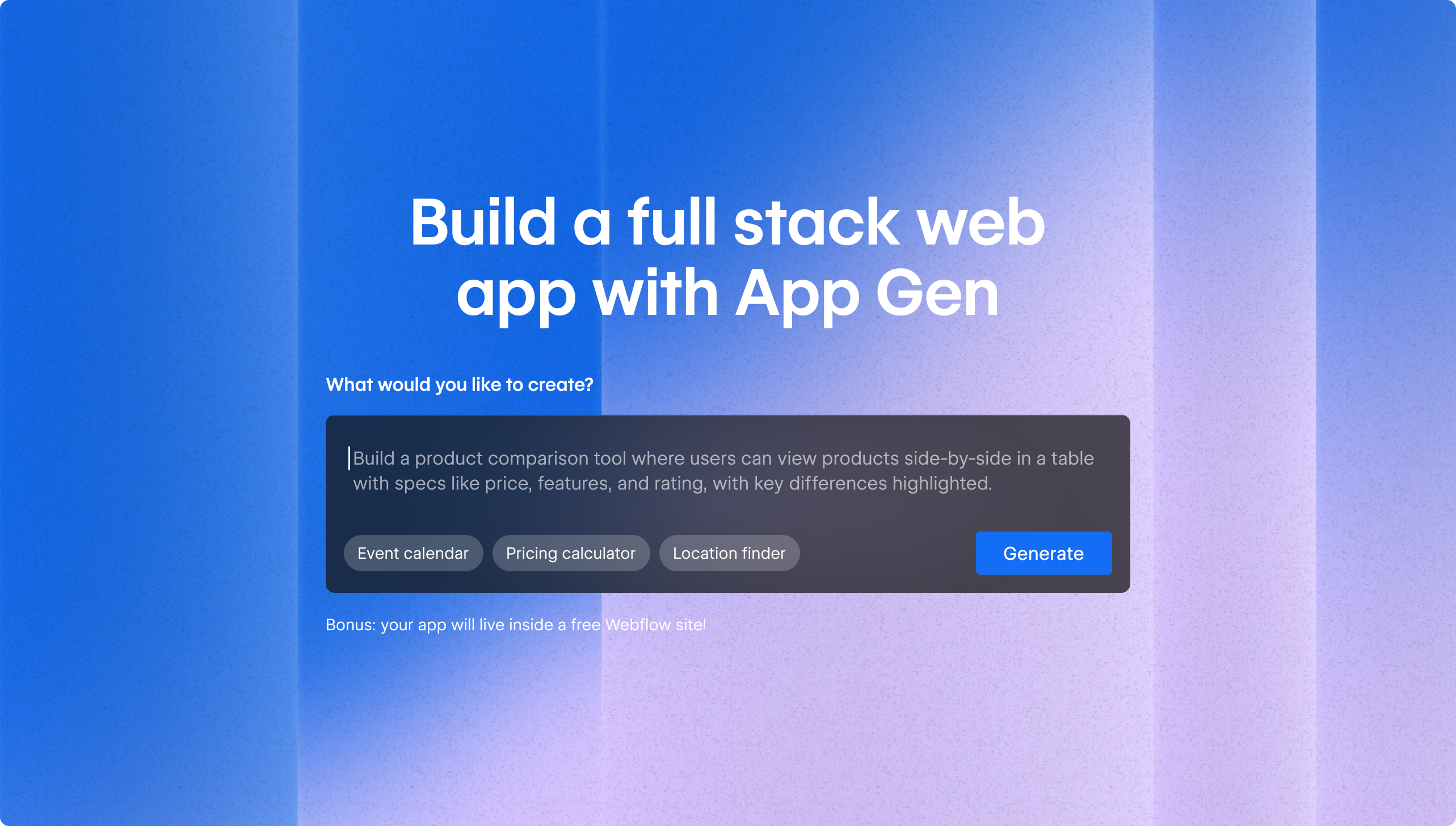
App Gen was Webflow’s solution for generating interactive web apps (e.g., event calendars, location finders) from natural language prompts. It launched to public beta with a landing page where site visitors could type a prompt and get a functional app in Webflow.
I owned content design for the end-to-end experience: the landing page, the full first-time user experience (FTUX), and eventually the content strategy for deprecating App Gen and launching its successor, AI code components.
Key challenges
Every app generated with App Gen required an attached Webflow site, and deploying the app also published that site, regardless of whether the user had seen it.
I didn’t want users to discover that dependency at the exact moment they were ready to deploy, after they’d already invested time generating and customizing their app. Users would also move between two distinct environments — the App Gen surface, where they iterated on their app, and the site surface, where the companion site lived — so the site needed to be introduced early enough to orient them to the full experience.
Goal
Make the App Gen landing page a frictionless entrypoint for any site visitor to generate an app, and turn the required companion site from an unwelcome surprise into an expected and exciting part of the experience.
Process
Reframing the dependency as a bonus
My solution was to reframe the required site as a bonus and introduce it at the very first moment of the experience — on the landing page, before the user submitted a prompt. The rest of the FTUX then had to deliver on that framing.
I designed the onboarding architecture around two sequential checklists, one for the app and one for the site, each preceded by its own modal to set the stage. The framing deepened as users progressed through the flow, with the site starting as a free bonus on the splash screen, an AI-powered asset in the App Gen welcome modal, and finally the app’s foundation once the user reached their companion site.
App Gen end-to-end experience
The landing page entrypoint. “Bonus: your app will live inside a free Webflow site!” appeared immediately below the prompt box on the splash screen — up front, before the user submitted their prompt. Each part of that string had its own impact:
- “Bonus” signaled an addition; the user got extra value on top of what they came for.
- “Live inside” made the relationship between the app and site feel spatial and intentional, and subtly reinforced the hosting structure (i.e., the app would be deployed to a subpath on the site’s domain).
- “Free Webflow site” incentivized the user to try the product.
After submitting a prompt and logging in or creating an account, the user would land here while the app was generating. The language here shifted from “free Webflow site” to “AI-powered site” — “free” made sense on the landing page where the user was deciding whether to try the product, but once the user was inside, the relevant frame became capability. What did the companion site actually unlock?
The welcome modal also oriented the user to the experience, setting up the two-environment structure the user was about to move through.
The FTUX checklist that followed continued this framing, reinforcing the site as a destination the user would actually want to reach.
The theme customization tooltip copy (“Adjust colors, typography, and more across your app and included site”) described the site as something connected to the app to plant the idea that changes made to the app carried through to both environments, again preparing the user to navigate through both.
When the user reached the “Deploy your app” step, they encountered the deployment and site publishing constraint. The language anticipated and named what the user might be anxious about at this point in the flow (i.e., going live with a site they haven’t seen or touched yet).
By this point, the user understood the site as an asset worth customizing. The tooltip continued that framing, making the site publish another expected and intentional step in the setup sequence.
The headline here marked the handoff between the app and the site and reframed the site again as infrastructure the app depended on.
The site FTUX checklist mirrored the App Gen checklist for consistency — same pattern, new environment — which reduced friction when the user encountered an unfamiliar surface.
The steps walked users through the site’s core capabilities in sequence, ending with publishing to close the loop on the dependency introduced on the splash screen and mentioned again when the app was deployed.
The “Published” status was the final payoff for the flow that started with “your app will live inside a free Webflow site” — the user had built, customized, and shipped both.
Deprecating App Gen and launching AI code components
The beta feedback for App Gen told us that users didn’t want standalone apps. They wanted components they could reuse across their Webflow sites. In response, Webflow deprecated App Gen and launched AI code components as its successor.
Deprecating a product still in public beta after a major marketing push required a confident content strategy. I partnered with product marketing to develop the narrative across an email sequence for existing App Gen beta users, in-product awareness messaging, and a blog post announcing AI code components.
The narrative I pushed for was “we listened and learned” — App Gen showed us what users wanted, and Webflow answered with AI code components.
Results
FTUX shipped as one connected flow that escalated the site’s value at each stage. In design review, the recurring feedback was that the dependency read as intentional rather than accidental; I don’t have user data confirming that held once App Gen was live.
The deprecation narrative shipped across all three surfaces ahead of App Gen’s retirement.
Reflections & learnings
Without user testing, the landing page copy was a judgment call. The “bonus” framing tested well internally, but I don’t know whether it changed how users experienced the site requirement downstream.
The two-checklist structure for the end-to-end flow assumed users would move through App Gen and then into the site in sequence. I’d like to see data on how many users progressed neatly through the happy path and how many abandoned at the app-to-site transition point. The drop-off rate would help me understand whether the “Customize your included site” framing worked as a bridge or whether users abandoned there instead.